The odd design and architecture critique, because who do I think I am after all? Well, I’m not a High End Mall Rat, for one, so lemme holla at ya just a bit.


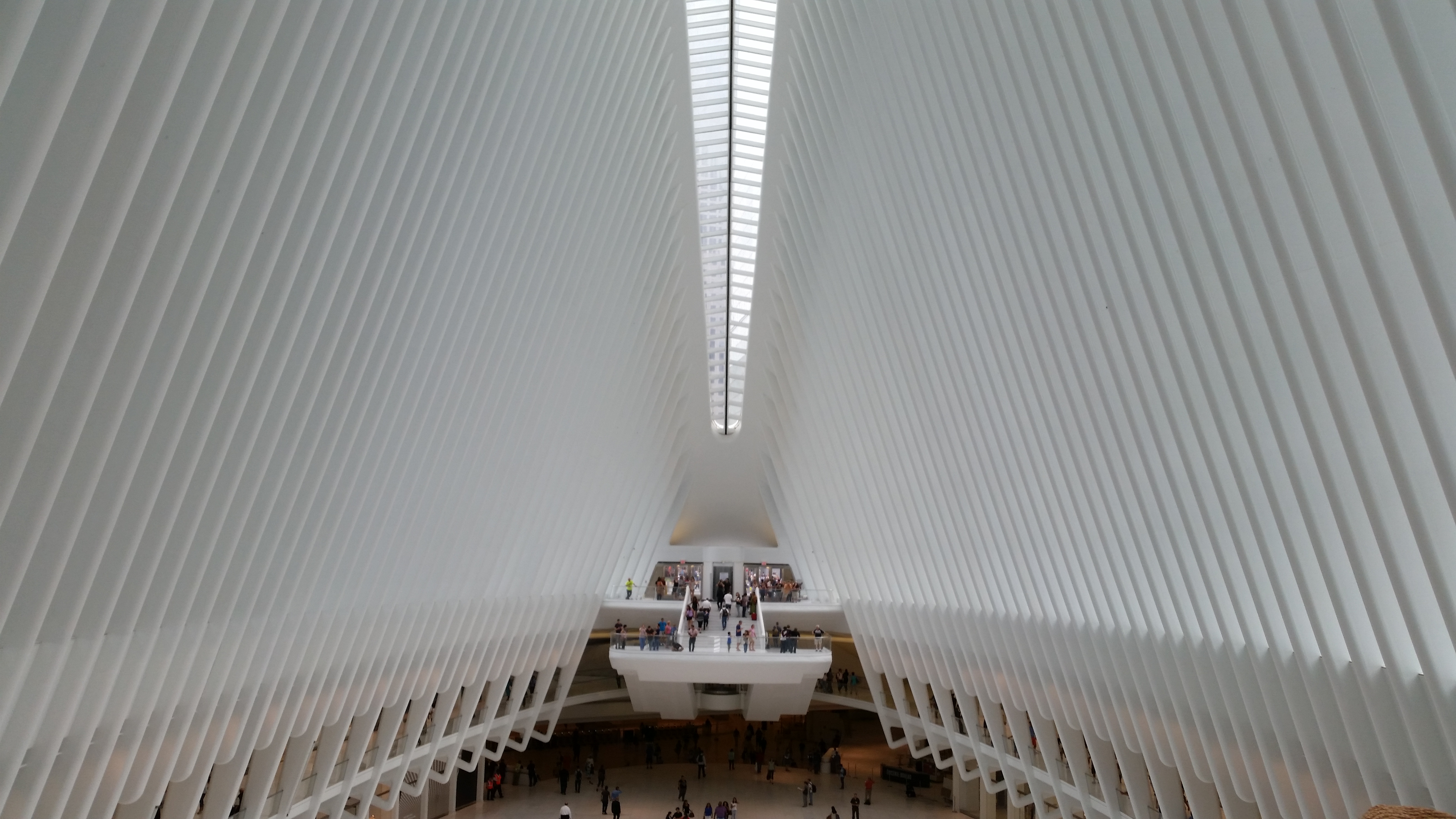
At first glance, walking by down the block, I thought THE OCULUS, NYC’S new downtown transportation hub by architect SANTIAGO CALATRAVA, was a pretty remarkable design. It looked like an immense dinosaur skeleton, half disinterred and sun-bleached, lying in what would have once been the shadow of The Twin Towers. I waited patiently for its completion, devouring all the artist renderings that showed up in my social media feeds. There was a buzz
Upon walking inside the completed structure for the very first time, my first thought was, holy crap this is going to be amazing when the light comes through the ribs! Then I walked outside and looked around and realized quickly that very little light would ever be coming through the ribs because it lay in the shadow of otherwise unremarkable buildings that were rendered no more remarkable by having a unique design thoughtlessly shat between them. And the saddest part of all is that in the absence of light, The Oculus just sits there looking pretentious and out of place. None of that is helped by the fact, that after all, it’s really just a train station and a mall. Don’t get it twisted on the first part. It’s my firm belief, almost religious, that public spaces and public buildings should be a grand gesture to the people who’ll be using them, but if there was any gesture it was spoiled by careless placement. Sorry, but the design was not enough. It needs the light to be art. Worse that anything though, is that the powers-that-be, those who make the decisions on how public space will be utilized, couldn’t conceive of anything more…. more something…. more anything, than a high end mall. And the interior design of the mall areas is no different than they’ve been using in building multi-level malls since the end of The Second World War.
For all the thought that went into the basic design, we’re left with a Basic Bitch.
I’m calling out HUDSON YARDS while I’m at it, The Vessel, The Shed and all. For all the work that they put into the design of some of the structures, the exterior design mostly, not an ounce of imagination was left over for either placement or the interiors.
It’s another mall, filled with stores and restaurants that unlike most regular malls, most regular New Yorkers can’t afford to visit. It’s crowded. It’s dark. It’s ten pounds of shit in a five pound bag. The entire multi-billion dollar project was designing exteriors, talking about exteriors, hyping exteriors and little else. What it really is, if you want the truth, is a housing project for the impossibly wealthy, with attached shopping and entertainment complexes.
How utterly pedestrian. How fucking boring! A housing project and an expensive mall with a prohibitively expensive food court.
Both facilities are like monuments to basic.
Call this my Argument of the Day maybe, but try to change my mind. Imagine if the planners had shown some respect to the designs and maybe just given them space and light. Imagine more creative use of the public space. Both sites are the equivalent of pulling down a masterwork from a gallery or museum and locking it in a dank closet where nobody will ever lay eyes on it in the proper light.
That’s what we’ve got. They are insults to the visions of the creators, and to artists in general.
